Fanta: A Pop of Fun-ta


Fanta, part of The Coca-Cola family, has announced its first ever global brand identity aimed at inspiring people to reinstate playfulness into the world with bright and bold designs that punch through the routine of everyday life. The new brand identity aims to inspire people to find the fun in life and make the plain playful, with a look that remains unmistakably Fanta.
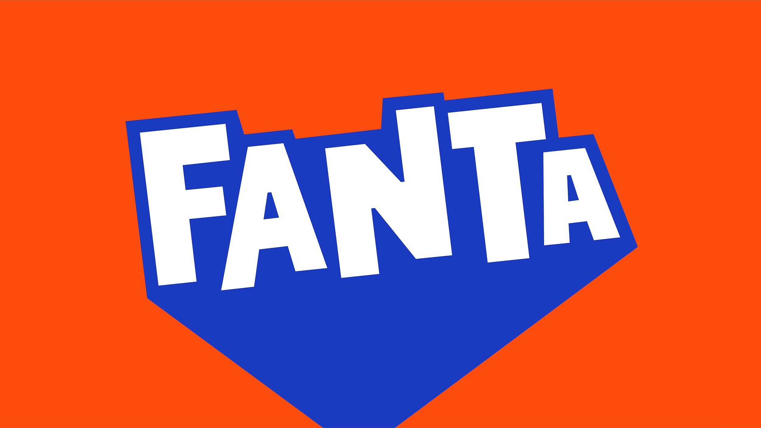
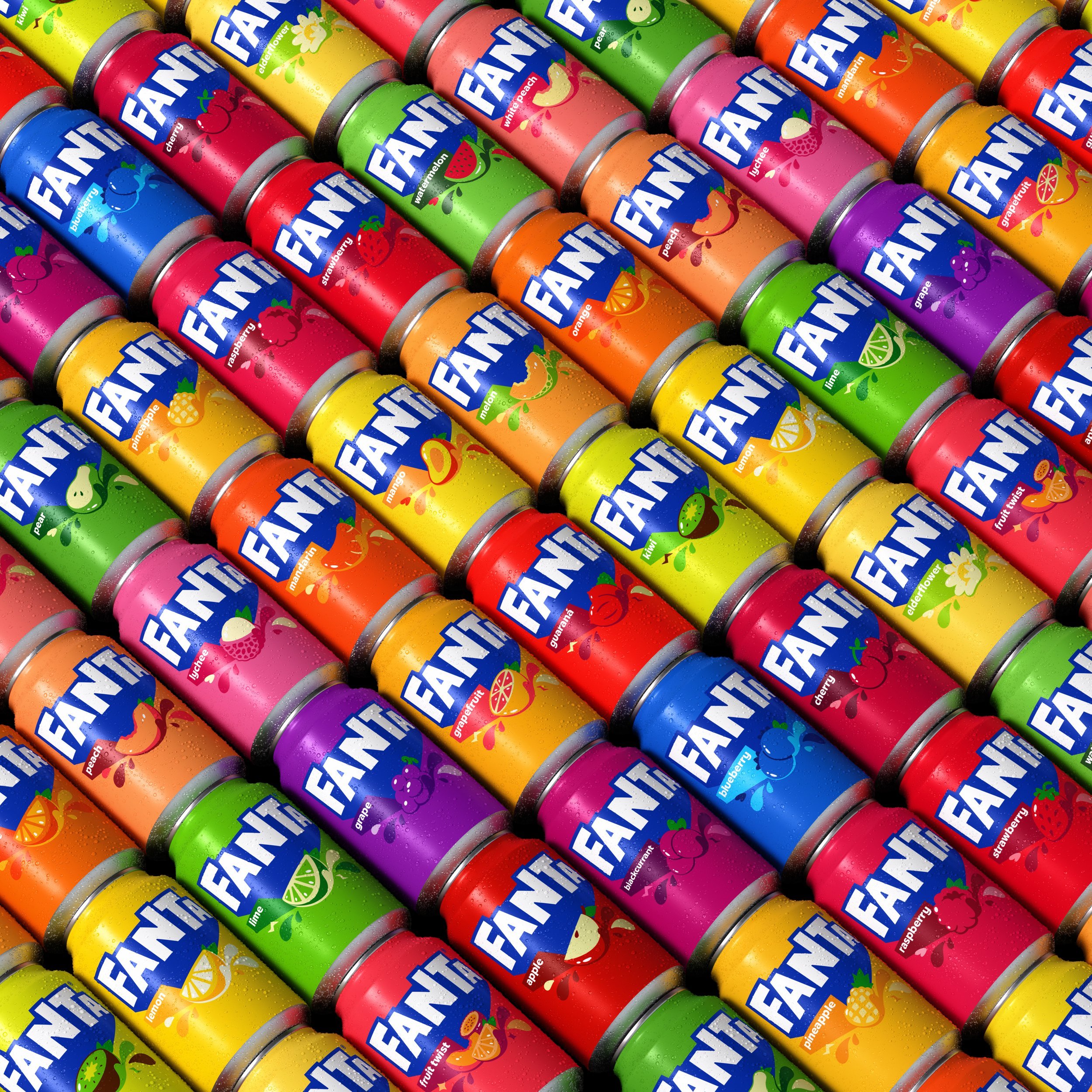
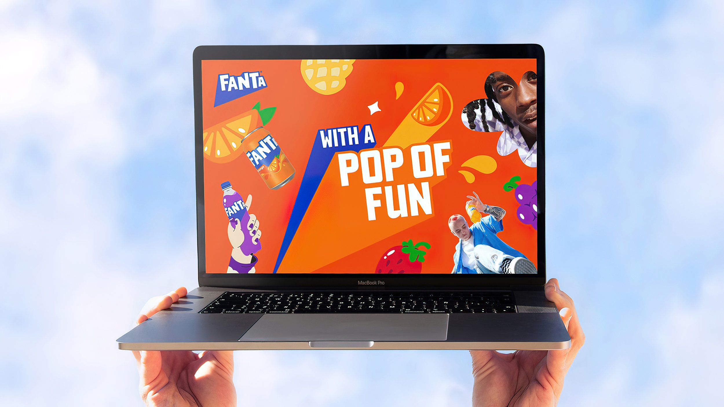
The new logo and custom typography now embody the presence and personality of Fanta, but with a POP! The brand color system is comprised of unique and identifiable colors that provides the brand with an endless range of flavor possibilities. The graphic system, inspired by the new dynamic logo, helps Fanta infuse playfulness into the world in a way that cuts through and packs a punch.
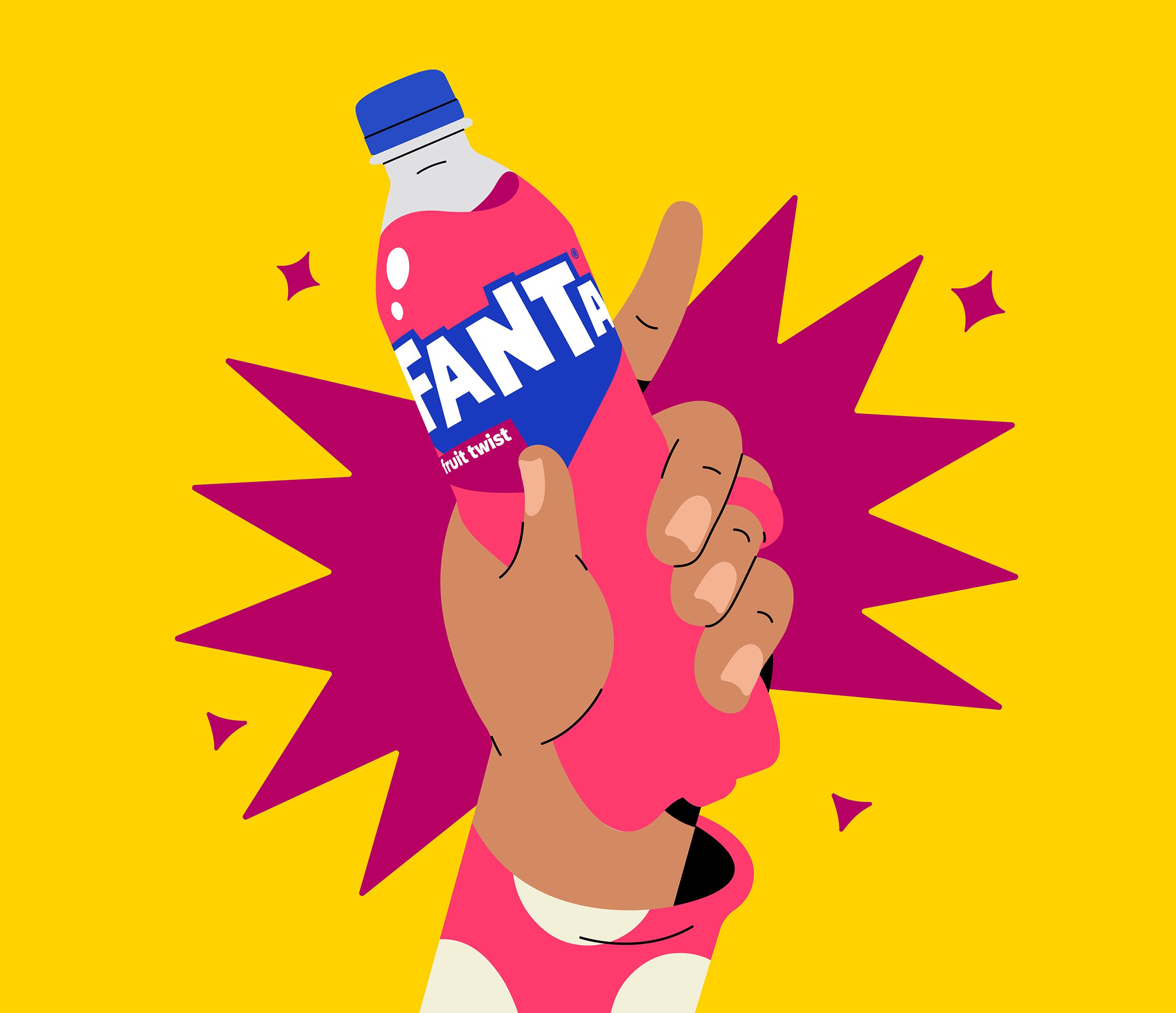
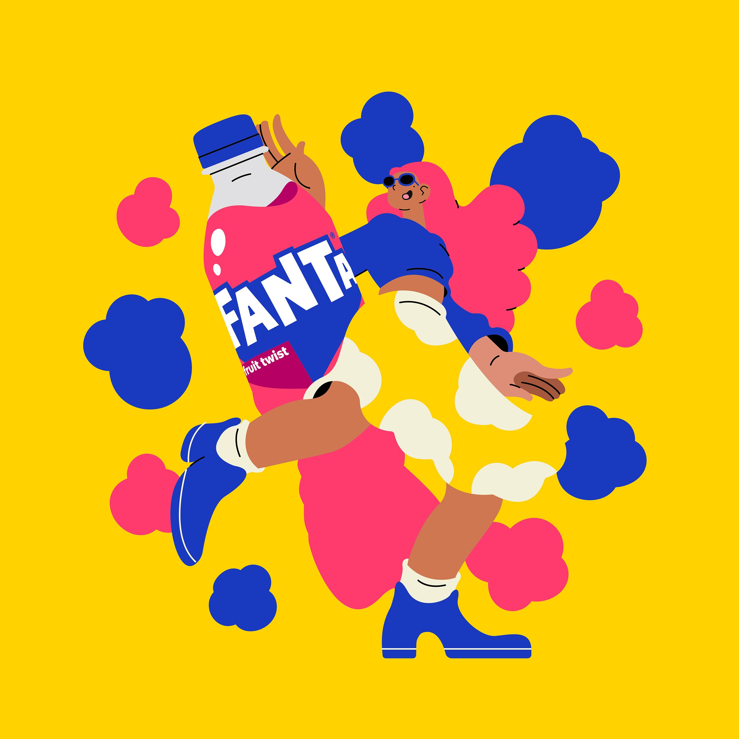
Illustrations, worked on in partnership with Brazilian illustrator Lucas Wakamatsu, and photography serve as an important tool that brings a Pop of Fun-ta to life by emphasizing the aesthetic of mixed media, layering, imperfection, and storytelling, to create a distinctive point-of-view intended to cut through visual clutter.
Credits:
Agency: Jones Knowles Ritchie
ECD: Lisa Smith
Featured Press:
2023 Featured on Dieline: Coca-Cola Unveils New Global Brand Identity For Fanta
2023 Featured on Dezeen: Fanta Rebrands with a Truly Playful Global Identity
2023 Featured on Pentawards: Coca-Cola Introduces Fanta’s New Global Brand Identity
2023 Featured on Brand New Under Consideration: New Logo Identity And Packaging For Fanta
2023 Featured on Creative Review: Fanta Unveils Bubbly Global Branding
2023 Featured on Design Week: How JKR designed a global identity to give Fanta back its POP
2023 Featured on AdAge: See Fanta’s Playful New Look
2023 Featured on Creative Bloq: Fanta's Fresh Global Identity Aims to Be Bold
2023 Featured on Marketing Week Fanta Revamps Logo with Launch of First-Ever Global Identity
2023 Featured on Fast Company: Fanta’s new logo ditches the fruit, just like its soda